As the keynote in September 2026 approaches, attention is turning with even more intensity to the iPhone 18 Pro, Apple’s flagship model. The element that captures the imagination of enthusiasts and experts is now less technical than visual: the new flagship color that the Apple brand might unveil for this highly anticipated smartphone. While technological advances seem to be becoming increasingly incremental, Apple is rethinking its aesthetic approach by betting on a bold color, a deep red almost unprecedented in the Pro range. A decision that goes beyond a simple aesthetic choice to become a powerful marketing lever and a strong visual signature. But will this shade conquer fans and encourage user adoption in a saturated market?
In a context where major innovations in mobile technology are rare, it is often through subtle design evolutions and material choices that Apple creates a differentiating experience. This possible deep red, dark yet radiant, is meant to assert the personality of the iPhone 18 Pro against fierce competition. Moreover, technical leaks hint at a bolder color range than ever before, ranging from burgundy to electric violet, not to mention innovative earthy tones. Each of these shades reflects an Apple strategy aimed at redefining the codes of luxury and modernity in the sphere of high-end smartphones.
This article focuses on decoding this entirely new aesthetic approach by Apple, analyzing how this new color fits into the continuity of Apple design, and understanding its significance in terms of brand image and competitiveness. We will also examine the potential impact on user adoption, smartphone trends, and the implications around the product launch, drawing notably on examples, recent data, and market analysis feedback.
- 1 A deep red announced as the flagship color of the iPhone 18 Pro: between strategy and visual innovation
- 2 The commercial and marketing implications of this new signature color
- 3 The evolving role of Apple design: from traditional minimalism to a chromatic assertion
- 4 Rumors and leaks about the final palette: between uncertainties and certainties
- 5 How the new deep red shade fits into the current smartphone trend
- 6 The impact on user adoption and prospects for the future of the iPhone range
- 7 List: The 5 essential reasons why deep red is the strategic color for the iPhone 18 Pro
A deep red announced as the flagship color of the iPhone 18 Pro: between strategy and visual innovation
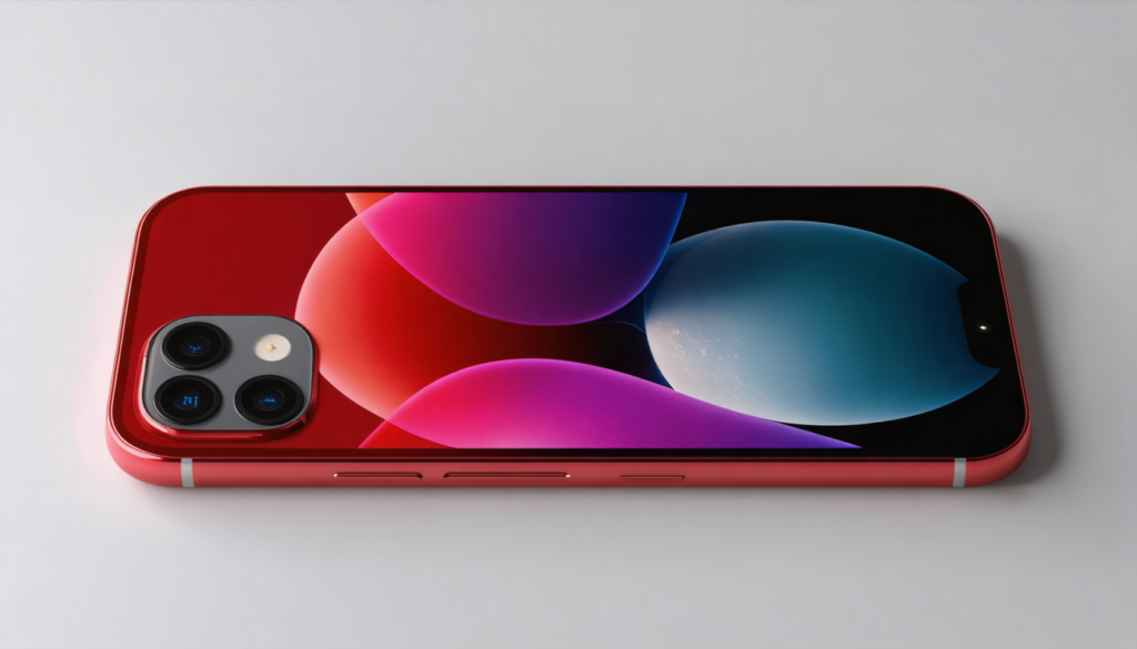
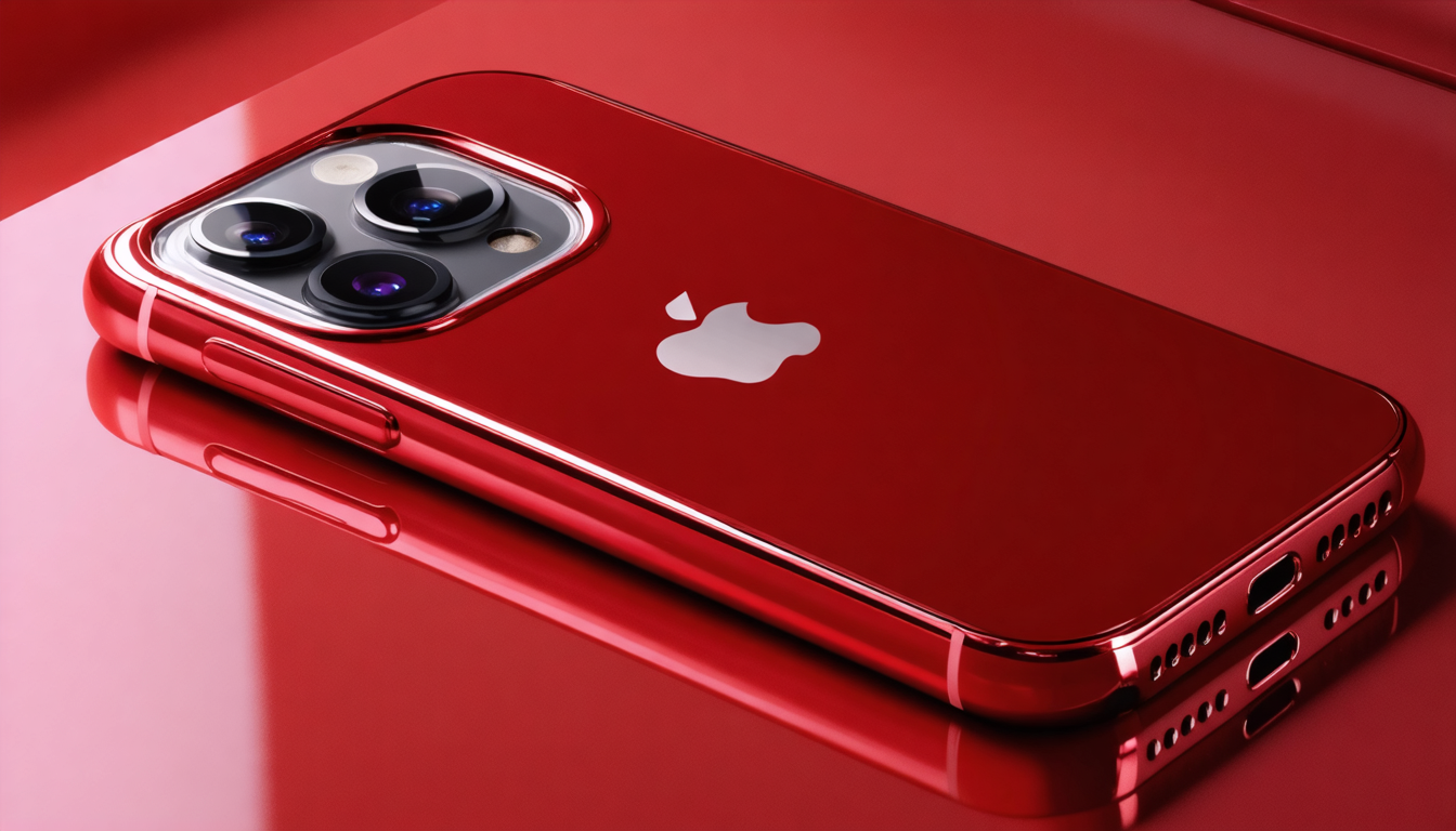
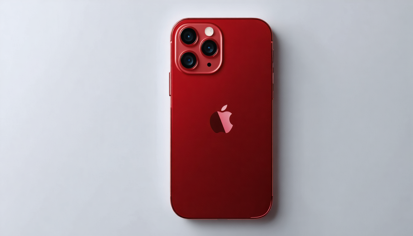
The first major observation regarding the iPhone 18 Pro in 2026 is the possible adoption of a deep red as the signature color. This tone, darker and more sophisticated than the traditional bright red, is expected to embody a form of Apple innovation within the range of shades offered so far for Pro models.
Beyond the mere color, this decision demonstrates Apple’s desire to reaffirm its visual identity while appealing to a demanding clientele, seeking not only performance but also an object with a strong design. The deep red resembles an aesthetic bet aimed at creating an immediate “wow” effect in-store and in communication. Unlike classic and often neutral shades like space gray or silver, this color offers a clear break, a strong signal in a world where every design innovation must be justified given the market’s maturity.
The stakes are thus twofold: on one hand, to inject new dynamism into the Pro line, which for several generations has struggled to surprise on the design front. On the other hand, to leverage color as a tool for commercial differentiation, capable of rekindling consumer interest and even extending the product life cycle. We know well that a simple subtle change in palette can strongly influence purchasing decisions, as evidenced by numerous marketing studies in the sector.
Pioneers of mobile often relied on color to mark a new era or create an iconic model. The iPhone 18 Pro could join this lineage, with a shade that aims to be as versatile as a Ferrari red, evoking luxury, power, and elegance. The deep red would offer a feeling of novelty with sobriety, avoiding the too “loud” or marketing-driven aspect in favor of a more mature and premium touch.
This trend toward a bold shade coincides with a period where Apple design is scrutinized closely, the company seeking to remain a reference both aesthetically and technically. A striking look could revitalize the image of the iPhone Pro, especially facing the rise of other brands that have also adopted more unexpected and modern color palettes.
The commercial and marketing implications of this new signature color
Apple’s strategy regarding the color choice for the iPhone 18 Pro is not limited to a simple style exercise. In reality, it is a deliberate commercial maneuver to support the product launch in a context where smartphone sales growth is stabilizing, even slowing down.
Beyond its aesthetic appeal, the deep red could act as a powerful lever for user adoption. This shade, immediately recognizable, will help the iPhone 18 Pro stand out on distributor shelves and online. It represents an opportunity for Apple to revitalize the perception of its Pro models, offering a unique emotional reason to choose this smartphone beyond its standard iPhone features.
Several points explain this strategic importance:
- Novelty effect: an innovative color naturally creates excitement and particular interest, even for users who do not systematically seek the latest technical features.
- Brand and identity: the new color becomes a strong visual marker that situates the product in an era, bringing symbolic value beyond raw technology.
- Premium segment: by relying on a sophisticated shade, Apple reinforces the luxurious position of the iPhone 18 Pro, thus justifying its high price and making the model desirable to a design-sensitive clientele.
- Viral effect: the color attracts attention on social networks, in videos and marketing campaigns, generating word of mouth and strong visibility.
However, this colorful approach does not apply uniformly across the entire range. While the Pro models might see this bold palette evolve, experimental products such as the foldable iPhone are expected to come in more sober shades — black, white, silver — so as not to confuse early adopters who remain cautious. This segmentation results from in-depth reflection on user adoption and the specific expectations of each product category.
In summary, color has become a central asset in the commercial battle between Apple and its competitors, especially in 2026, where mere performance is no longer enough. The aesthetic dimension, orchestrated by controlled choices around the flagship shade, establishes itself as a key element to stimulate renewal and enthusiasm.
Table: Commercial impact of colors in the high-end smartphone market
| Color | Consumer perception | Impact on sales | Marketing positioning |
|---|---|---|---|
| Deep red (iPhone 18 Pro) | Luxurious, bold, distinctive | Strong potential for revival | Iconic premium model |
| Space gray | Classic, sober, professional | Stable but not very differentiating | Traditional users |
| Electric violet | Young, dynamic, innovative | Attracts a younger clientele | Creative positioning |
| Earthy brown | Natural, warm, original | Niche segment | Alternative style |
The evolving role of Apple design: from traditional minimalism to a chromatic assertion
Apple is renowned for its clean and minimalist aesthetic, a style that has shaped the visual language of many products for more than a decade. However, with the iPhone 18 Pro, a new dimension seems to be emerging: that of a character affirmation through color. This shift from an almost clinical neutrality to a deep red reflects a willingness to disrupt habits while remaining faithful to principles of refined finishing and sophisticated quality.
Apple design has always been based on balance: simplicity of forms, premium materials, intuitive and elegant user interface. But this model is now moving toward a more expressive design, where color becomes a narrative element. In other words, it is no longer just an aesthetic tool; it is a vector of story and image for the brand.
This transition represents a challenge since boldness in terms of color palette can conflict with the perception of traditional users accustomed to classic shades. However, current trends show that consumers, especially younger people and content creators, precisely seek this type of strong visual identities that stimulate the personality of their phone.
It is worth recalling that Asian manufacturers have seen their market share rise thanks to marked color choices that strengthen community attachment. Apple thus seems to respond to this trend while keeping its unique touch — deep, elegant, and refined shades, far from flashy or loud palettes.
Concrete example: The “cosmic orange” color launched in the previous generation, although bold, did not achieve worldwide success, but it paved the way for questioning the importance of shades as a distinctive sign. The deep red of the iPhone 18 Pro is therefore a natural evolution along this path.
Rumors and leaks about the final palette: between uncertainties and certainties
Eight months before the launch of the new Apple smartphone, leaks are numerous but sometimes contradictory about the final color palette. Jon Prosser, a famous leaker, mentions in several videos a range of potential shades for the iPhone 18 Pro: elegant burgundy, bold electric violet, earthy brown, and of course this deep red presented as the main candidate.
These revelations illustrate the iterative process at Apple, which tests various options to find the best possible consumer response. This pictorial abundance also reflects the brand’s ambition not only to offer a technically efficient product but also a personalized aesthetic experience. Each color is therefore as much a message as a technical and industrial choice.
It is important to note that even if deep red seems the most likely flagship shade, Apple probably allows itself diversification around more nuanced powders, to satisfy different user profiles. The Pro range could thus become a broader spectrum where each shade unfolds its own universe, allowing the user to choose a smartphone that better reflects their personality.
This plurality of colors also appears as a direct response to the competition which, for several years, has broken codes with original and very varied colors, inviting historic brands to open up to more boldness.
In this context, the launch date in September 2026 will be decisive. Apple will have to present a coherent and enticing line, with strong communication around refreshed Apple design, so that the flagship shade is not just a gimmick but indeed the driving element of the image renewal.
How the new deep red shade fits into the current smartphone trend
In 2026, the smartphone market is at a turning point where differentiation by pure technology tends to fade before a quest for visual identity and enhanced user experience. In this framework, the smartphone trend emphasizes sophisticated finishes, innovative materials, and above all color choices that capture attention while offering a premium feel.
The deep red shade envisioned for the iPhone 18 Pro fits perfectly into this movement. It symbolizes the desire of a historic brand to assert its character without going to extremes, allowing it to attract a clientele segment fond of elegance and moderate originality. The red, intense yet refined, offers the user a sensation of accessible luxury, while maintaining a sober and timeless look.
This choice finds echoes in strategies adopted by other players in the sector, who multiply limited editions, artistic collaborations, and colorful variations to create strong emotional capital around their products. For Apple, this dynamic passes through precise and controlled color management, which becomes a true storytelling tool.
Moreover, color can positively influence the tactile and visual feeling of the smartphone. Recent research explains that certain shades increase psychological attachment to the product, thus improving perceived well-being and overall satisfaction. The deep red, by its strong yet soft presence, could play this differentiating role in a range where every detail counts.
The impact on user adoption and prospects for the future of the iPhone range
The central question that drives observers today is whether this new color will become a catalyst for user adoption of the iPhone 18 Pro. The smartphone sector is saturated, renewal cycles are lengthening, and loyalty is becoming a major challenge.
Offering a bold flagship shade, breaking with usual codes, would allow Apple to attempt a new form of attraction. In particular, it could attract customers eager to own an object that is both high-performing and distinctive, capable of displaying a unique style.
In this mechanism, color becomes a powerful social marker. Having a deep red iPhone 18 Pro would be equivalent to displaying belonging to a community of avant-garde users, sensitive both to elegance and innovation. This role of visual identifier could encourage sales and strengthen the overall market dynamic.
Nevertheless, this strategy carries a risk: a too marked color can also limit desirability among those who prefer discretion or more neutral shades. Apple will therefore have to balance boldness and accessibility and likely propose a diversified palette to satisfy a broad audience.
Ultimately, this bet on color reveals a profound evolution in the way Apple conceives its products. Rather than selling only features, the brand increasingly emphasizes a complete experience where design, color, and identity play dominant roles.
List: The 5 essential reasons why deep red is the strategic color for the iPhone 18 Pro
- Clear visual identification: allows immediate recognition of the model in a competitive environment.
- Emotional stimulation: evokes a stronger attachment thanks to an elegant and intense shade.
- Launch energization: creates a novelty effect that boosts media and commercial interest.
- Enhanced premium positioning: enhances the luxury and exclusivity aspect of the smartphone.
- Distinct segmentation: clearly differentiates the Pro range from other models and experimental products.